DeFarm


Category:
Blockchain
Client:
DeFarm
Duration:
3 weeks
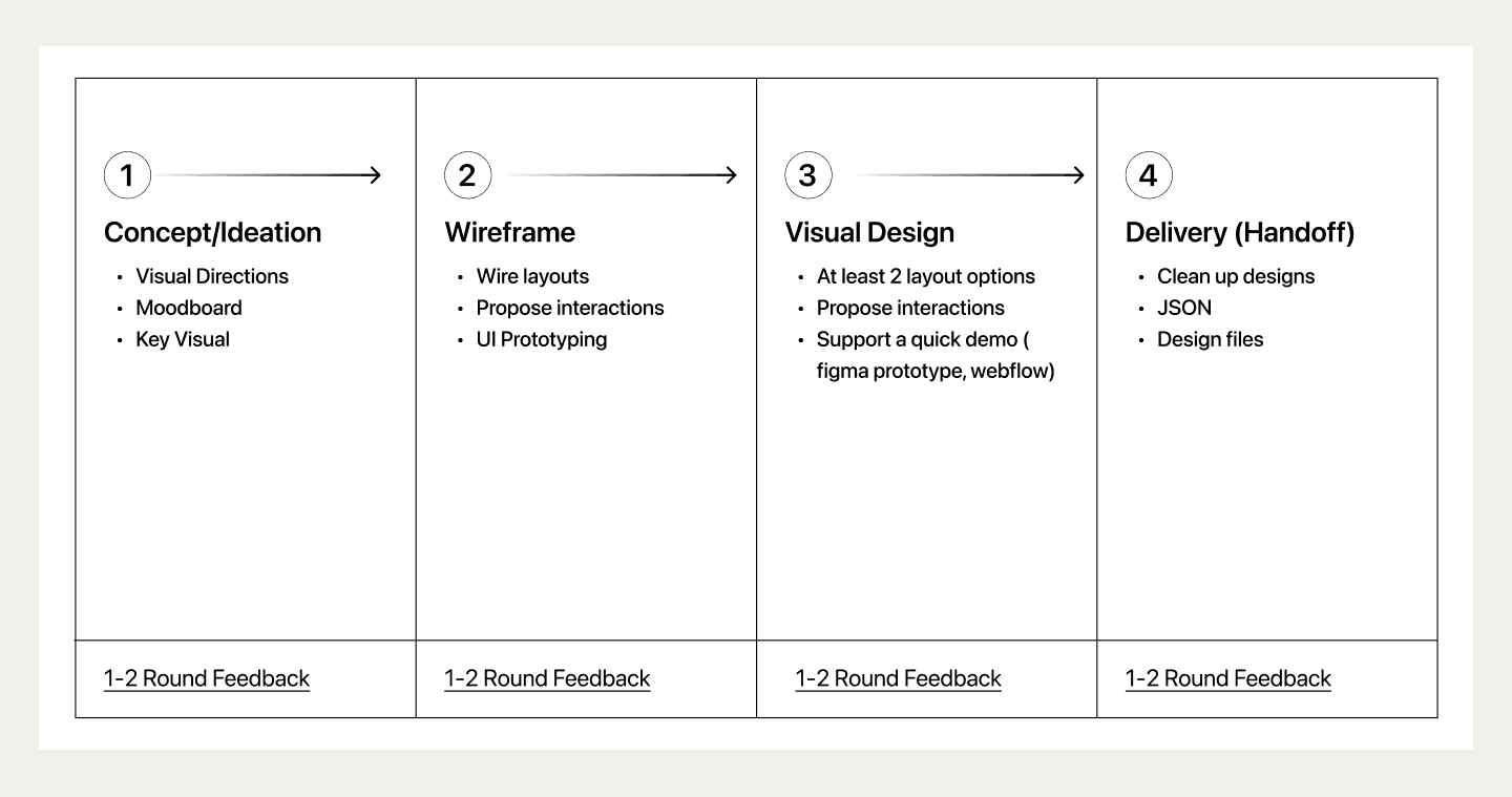
Thesis
The DeFi industry has long relied on token rewards to attract liquidity and encourage participation. While effective in the short term, this model often creates inflationary pressure and attracts users who are motivated primarily by incentives rather than long-term value.
The goal of deFarm was to explore a different approach—making professional asset management and copy trading more accessible through a product that feels transparent, trustworthy, and easy to use for both new and experienced crypto investors.

Design Process
The project was completed over two weeks, following a lean product design process that balanced strategy, user experience, and visual execution.
Discovery & Strategy
Wireframing
UI Design
Handoff
Project Goal
Design a copy-trading and active portfolio management platform that simplifies DeFi investing while building trust through a clear and intuitive user experience.
User Research
Instead of designing for "crypto experts," I focused on users with different levels of investment experience.
Hằng
A 35-year-old stay-at-home mother from Vietnam. She regularly saves part of her monthly income and is familiar with digital wallets like MoMo but has limited exposure to crypto investing. She values simplicity, security, and predictable returns.
Amir Singh
A 28-year-old software engineer from India who recently entered the crypto market. He primarily invests in Bitcoin and Ethereum and values transparency, low fees, and data-driven decision making.
These personas helped shape the information architecture, onboarding flow, and dashboard experience.

Moodboard
The visual direction focused on making DeFi feel approachable rather than intimidating.
Keywords
Bold
Colorful
Playful
Modern
Illustration-driven
The design combines lifestyle photography with custom illustrations to communicate finance in a more human and accessible way.

Sitemap
Before moving into UI, I mapped the product structure to organize the key user journeys and prioritize the most important actions.
The sitemap helped define how users navigate between portfolios, copy trading, wallet management, and investment insights while keeping the experience straightforward.

Wireframes
Wireframing was the most collaborative phase of the project.
Instead of discussing colors or branding, every review focused purely on user experience—navigation, information hierarchy, and task completion. Validating the product flow early allowed visual design to move much faster.

UI Foundation
To create a recognizable product identity, I developed a custom visual system rather than relying on stock assets.
Custom Illustrations
A complete illustration library was created to support onboarding, empty states, and marketing sections while reinforcing the brand personality.

Visual Design
The visual design phase took approximately one week.
Most of the time was spent creating reusable assets and refining the illustration system to match the brand identity. Once the design language was established, building the remaining screens became significantly faster while maintaining consistency throughout the product.
